Vue05
自定义指令
v-for、v-model等指令属于内置指令,每个指令都有自己独立的功能。
开发者自己定义指令,封装一些dom操作,扩展额外的功能
语法
自定义指令使用:
1
2
| 直接在对应标签上添加: v-指令名
比如: <input v-指令名 type="text"/>
|
实例
自定义指令v-focus,使得页面某些元素自动聚焦
1
2
3
4
5
6
7
8
9
10
11
12
13
14
15
16
17
18
19
20
21
| <template>
<div>
<input type="text" v-focus>
</div>
</template>
<script>
export default {
directives:{
focus:{
inserted(el){
el.focus()
}
}
}
}
</script>
<style>
</style>
|
自定义指令—指令的值
在绑定指令时,可以通过等号的形式为指令绑定具体的参数值
可以通过binding.value拿到指令值,指令值修改会触发update函数
实例
自定一个指令color,通过传入不同的颜色,给标签设置文字颜色
1
2
3
4
5
6
7
8
9
10
11
12
13
14
15
16
17
18
19
20
21
22
23
24
25
26
27
28
29
30
31
32
| <template>
<div>
<span v-color="color2">we are family</span>
</div>
</template>
<script>
export default {
data(){
return {
"color1":"red",
"color2":"blue"
}
}
,directives:{
color:{
inserted(el,binding){
el.style.color = binding.value;
},update(el,binding){
console.log("指令的值发生了修改");
el.style.color = binding.value;
}
}
}
}
</script>
<style>
</style>
|
插槽
插槽介绍
插槽能够让组件内部一些结果支持自定义
背景需求:
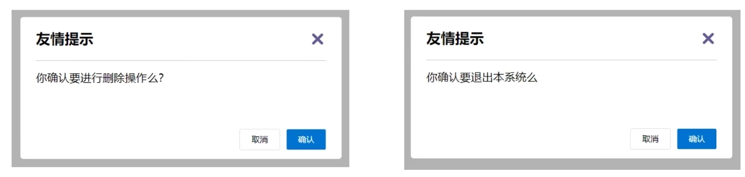
如下图所示,不同的页面显示的对话框,基本是一样的,只是组件的内容部分不一样,这样将对话框封装成一个组件,同时又希望组件内容部分不会写死,使用的时候自定义,就需要用到插槽
插槽基本语法:
- 在组件内将需要定制的结构部分,改用
<slot></slot>占位
- 使用组件时,利用传入的内容替换
slot
实例
DialogPage代码
1
2
3
4
5
6
7
8
9
10
11
12
13
14
15
16
17
18
19
20
21
22
23
24
25
26
27
28
29
30
31
32
33
34
35
36
37
38
39
40
41
42
43
44
45
46
47
48
49
50
51
52
53
54
55
56
57
58
59
60
61
62
63
64
65
66
67
68
69
70
71
72
73
74
75
76
77
78
79
80
81
82
| <template>
<div>
<div class="modal">
<div class="modal-content">
<span class="close-button">×</span>
<h2>友情提示</h2>
<p><slot></slot></p>
<div class="modal-actions">
<button class="cancel-button">取消</button>
<button class="confirm-button">确认</button>
</div>
</div>
</div>
</div>
</template>
<script>
export default {};
</script>
<style>
body {
font-family: Arial, sans-serif;
background-color: #f0f0f0;
display: flex;
justify-content: center;
align-items: center;
height: 100vh;
margin: 0;
}
.modal {
background-color: white;
border-radius: 5px;
box-shadow: 0 2px 10px rgba(0, 0, 0, 0.3);
width: 300px;
padding: 20px;
text-align: center;
}
.modal-content {
position: relative;
}
.close-button {
position: absolute;
top: 10px;
right: 10px;
font-size: 20px;
cursor: pointer;
}
h2 {
margin-bottom: 10px;
}
p {
margin-bottom: 20px;
}
.modal-actions {
display: flex;
justify-content: center;
gap: 10px;
}
button {
padding: 10px 20px;
border: none;
border-radius: 5px;
cursor: pointer;
}
.cancel-button {
background-color: #f0f0f0;
}
.confirm-button {
background-color: #007bff;
color: white;
}
</style>
|
App.vue代码
1
2
3
4
5
6
7
8
9
10
11
12
13
14
15
16
17
18
19
| <template>
<div>
<DialogPage>你确定要进行删除操作吗?</DialogPage>
</div>
</template>
<script>
import DialogPage from './components/DialogPage.vue';
export default {
components:{
DialogPage
}
}
</script>
<style>
</style>
|
插槽 - 默认值
在封装组件时,可以为预留的<slot></slot>插槽提供默认的内容
语法:在<slot></slot>标签内,防止内容,作为默认显示内容
插槽 - 具名插槽
当一个组件中存在多处结构都需要外部传入标签,进行定制,而默认插槽只有一个定制位置,这时候就需要用到具名插槽
具名插槽语法
- 多个
slot用不同的name属性进行区分
template配合v-slot:名字来分发对应标签v-slot:插槽名可以简化为#插槽名
代码示例
DialogPage.vue
1
2
3
4
5
6
7
8
9
10
11
12
13
14
15
16
17
18
19
20
21
22
23
24
25
26
27
28
29
30
31
32
33
34
35
36
37
38
39
40
41
42
43
44
45
46
47
48
49
50
51
52
53
54
55
56
57
58
59
60
61
62
63
64
65
66
67
68
69
70
71
72
73
74
75
76
77
78
79
80
81
82
| <template>
<div>
<div class="modal">
<div class="modal-content">
<span class="close-button">×</span>
<h2><slot name="header">友情提示</slot></h2>
<p><slot name="content">默认显示内容</slot></p>
<div class="modal-actions">
<button class="cancel-button"><slot name="cancelBtn">取消</slot></button>
<button class="confirm-button"><slot name="checkBtn">确认</slot></button>
</div>
</div>
</div>
</div>
</template>
<script>
export default {};
</script>
<style>
body {
font-family: Arial, sans-serif;
background-color: #f0f0f0;
display: flex;
justify-content: center;
align-items: center;
height: 100vh;
margin: 0;
}
.modal {
background-color: white;
border-radius: 5px;
box-shadow: 0 2px 10px rgba(0, 0, 0, 0.3);
width: 300px;
padding: 20px;
text-align: center;
}
.modal-content {
position: relative;
}
.close-button {
position: absolute;
top: 10px;
right: 10px;
font-size: 20px;
cursor: pointer;
}
h2 {
margin-bottom: 10px;
}
p {
margin-bottom: 20px;
}
.modal-actions {
display: flex;
justify-content: center;
gap: 10px;
}
button {
padding: 10px 20px;
border: none;
border-radius: 5px;
cursor: pointer;
}
.cancel-button {
background-color: #f0f0f0;
}
.confirm-button {
background-color: #007bff;
color: white;
}
</style>
|
App.vue
1
2
3
4
5
6
7
8
9
10
11
12
13
14
15
16
17
18
19
20
21
22
23
24
| <template>
<div>
<DialogPage>
<template v-slot:header>头部</template>
<template v-slot:content>内容部分</template>
<template v-slot:cancelBtn>取消按钮</template>
<template v-slot:checkBtn>确认按钮</template>
</DialogPage>
</div>
</template>
<script>
import DialogPage from './components/DialogPage.vue';
export default {
components:{
DialogPage
}
}
</script>
<style>
</style>
|
作用域插槽
定义slot的同时,是可以传值的,给插槽上绑定数据,将来在使用组件时可以直接使用
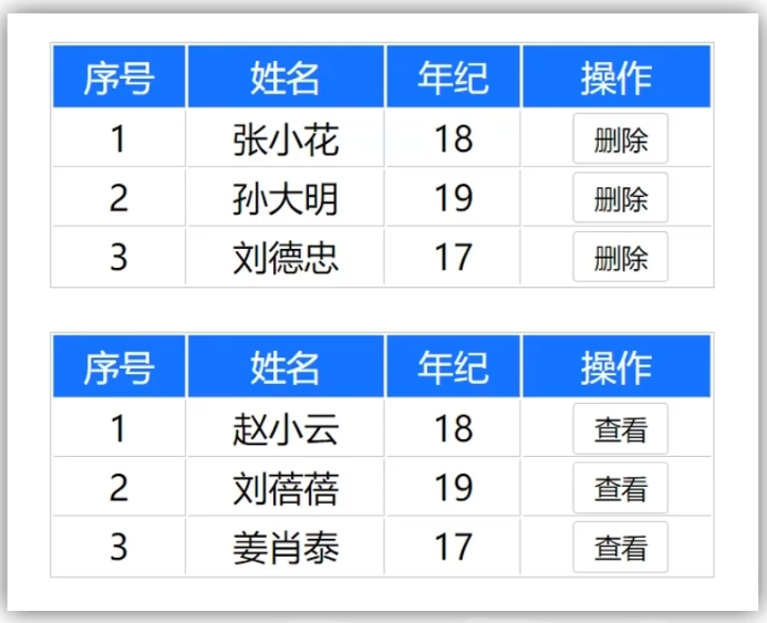
比如如下表格,不同形式最后操作一列可能是“删除”或者“查看”,这时候可以用具名插槽赋予不同值,但是删除或者查看时,需要当前项的id来获取对应的数据,
所以这时候就需要通过作用域插槽绑定对应值,便于后续使用
作用域插槽使用步骤:
- 给
slot加标签,以添加属性值的方式进行传值
- 所有添加的属性,都会被集中到一个对象中
- 在
template中,通过#插槽名=obj来进行接收,默认插槽写成#default="obj"
- 后续可以通过
obj来对对应属性值进行操作
TablePage.vue
1
2
3
4
5
6
7
8
9
10
11
12
13
14
15
16
17
18
19
20
21
22
23
24
25
26
27
28
29
30
31
32
33
34
35
36
37
38
39
40
41
42
43
44
45
46
47
48
49
50
51
52
53
54
55
56
57
58
59
60
61
62
63
64
65
66
67
68
| <template>
<div>
<body>
<table>
<thead>
<tr>
<th>序号</th>
<th>姓名</th>
<th>年纪</th>
<th>操作</th>
</tr>
</thead>
<tbody>
<tr v-for="(item,index) in data" :key="item.id">
<td>{{ index+1 }}</td>
<td>{{ item.name }}</td>
<td>{{ item.age }}</td>
<td><slot :row="item"></slot></td>
</tr>
</tbody>
</table>
</body>
</div>
</template>
<script>
export default {
props:{
data:Array
}
};
</script>
<style>
body {
font-family: Arial, sans-serif;
}
table {
margin:30px auto;
width: 60%;
border-collapse: collapse;
margin-top: 20px;
}
th,
td {
border: 1px solid #ddd;
padding: 8px;
text-align: center;
}
th {
background-color: #007bff;
color: white;
}
button {
padding: 5px 10px;
background-color: #f8f9fa;
border: 1px solid #ddd;
cursor: pointer;
}
button:hover {
background-color: #e9ecef;
}
</style>
|
App.vue
1
2
3
4
5
6
7
8
9
10
11
12
13
14
15
16
17
18
19
20
21
22
23
24
25
26
27
28
29
30
31
32
33
34
35
36
| <template>
<div>
<TablePage :data="list">
<template #default="obj">
<button @click="del(obj.row.id)">删除</button>
</template>
</TablePage>
</div>
</template>
<script>
import TablePage from './components/TablePage.vue';
export default {
components:{
TablePage
},
data(){
return {
list:[
{id:1,name:"赵晓云",age:18},
{id:2,name:"刘蓓蓓",age:19},
{id:3,name:"姜晓瑞泰",age:17}
]
}
},
methods:{
del(id){
this.list = this.list.filter((item)=>item.id!=id)
}
}
}
</script>
<style>
</style>
|
路由
单页应用程序
单页应用程序SPA(Single Page Application),所有的功能都在一个html页面上实现
单页面应用 vs 多页面应用
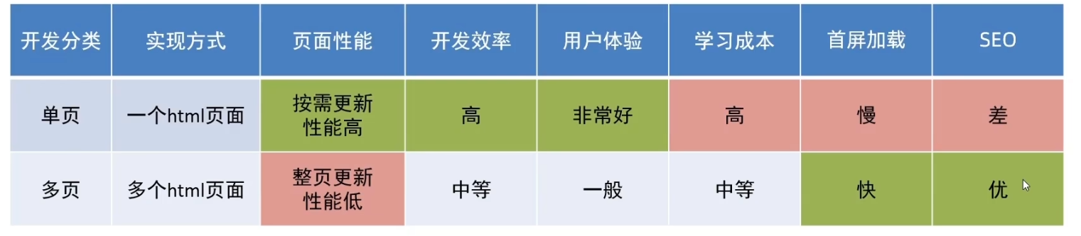
单页应用程序之所以开发效率高、性能高、用户体验好,最大的原因在于:页面按需更新
对于按需更新,首先需要明确:访问路径 和组件的对应关系
路由
路由本质是一种映射关系
Vue中的路由:路径和组件之间的映射关系
VueRouter
介绍
VueRouter是Vue官方的一个路由插件,是一个第三方包,当修改地址栏路径时,会切换显示匹配的组件
官网:VueRouter
VueRouter的使用
使用步骤:
以下五部代码在main.js中编写
①下载
下载VueRouter模块到当前工程,注意vue2对应的版本是3.x,本实例中我们安装版本3.6.5
②引入
1
| import VueRouter from 'vue-router'
|
③安装注册
④创建路由对象
1
2
3
4
5
6
7
8
9
| const router = new VueRouter() //参数为相应的路由规则
//配置路由规则,组件一般建议放在views目录下
const router = new VueRouter({
routes:[
{path:路径名称,componet:组件名称},
...
]
})
|
⑤注入
将路由对象注入到vue实例,建立关联
1
2
3
4
| new Vue({
render:h=>h(App),
router
}).$mount('#app')
|
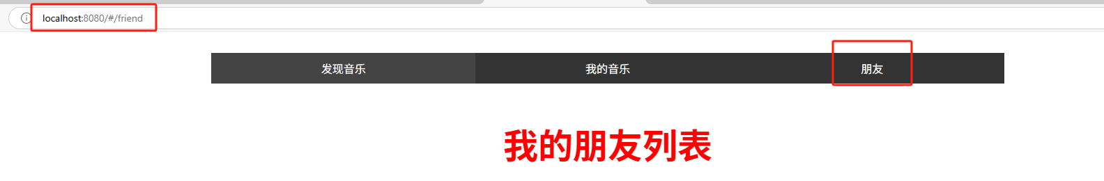
完成上面五步之后,在页面地址栏就会出现xxxx/#/
⑥配置导航以及路由出口
路由出口即路径匹配的组件显示的位置,vue提供标签<router-view></router-view>,路由匹配到的组件最终将渲染到这个标签所在的位置
实例
main.js
1
2
3
4
5
6
7
8
9
10
11
12
13
14
15
16
17
18
19
20
21
22
23
24
25
26
27
28
29
| import Vue from 'vue'
import App from './App.vue'
//1.导包
import VueRouter
from 'vue-router'
Vue.config.productionTip = false
//2.注册
Vue.use(VueRouter)
//3.创建路由对象
import FindMusic from './views/FindMusic.vue'
import MyMusic from './views/MyMusic.vue'
import MyFriend from './views/MyFriend.vue'
const router = new VueRouter(
{
routes:[
{path:"/find",component:FindMusic},
{path:"/my",component:MyMusic},
{path:"/friend",component:MyFriend}
]
}
)
new Vue({
render: h => h(App),
router
}).$mount('#app')
|
App.vue
1
2
3
4
5
6
7
8
9
10
11
12
13
14
15
16
17
18
19
20
21
22
23
24
25
26
27
28
29
30
31
32
33
34
35
36
37
38
39
40
41
42
43
44
45
46
47
48
49
| <template>
<div>
<div class="tab-container">
<div class="tab active"><a href="#/find">发现音乐</a></div>
<div class="tab"><a href="#/my">我的音乐</a></div>
<div class="tab"><a href="#/friend">朋友</a></div>
</div>
<div class="tab-content">
<router-view></router-view>
</div>
</div>
</template>
<script>
export default {
}
</script>
<style>
.tab-container {
display: flex;
background-color: #333;
width: 60%;
margin:30px auto;
}
.tab {
flex: 1;
padding: 10px;
text-align: center;
color: white;
cursor: pointer;
}
.active {
background-color: #444;
}
a {
all: unset;
}
.tab-content {
width: 60%;
font-size: 50px;
font-weight: 700;
color:red;
margin: 20px auto;
text-align: center;
}
</style>
|
FindMusic.vue
1
2
3
4
5
6
7
8
9
10
11
12
13
14
15
| <template>
<div>
<p>发现音乐</p>
</div>
</template>
<script>
export default {
}
</script>
<style>
</style>
|
MyMusic.vue
1
2
3
4
5
6
7
8
9
10
11
12
13
14
15
| <template>
<div>
<p>我的音乐</p>
</div>
</template>
<script>
export default {
}
</script>
<style>
</style>
|
MyFriend.vue
1
2
3
4
5
6
7
8
9
10
11
12
13
14
15
| <template>
<div>
<p>我的朋友列表</p>
</div>
</template>
<script>
export default {
}
</script>
<style>
</style>
|
效果
组件分类及其存放位置
在vue项目中,一部分组件放置在src/views目录下,另一部分组件放置在src/components目录下
其实.vue文件可以分为两类,页面组件和复用组件
页面组件一般需要配合路由去切换使用的,所以页面组件一般放置在src/views目录下
复用组件一般在多个不同页面中复用,这类组件一般放置在src/components目录下
其实本质都是.vue文件,无任何区别,之所以分开位置存放,是为了开发方便以及后续便于维护
 微信
微信 支付宝
支付宝